I have a special place in my heart for this house because it was my first official flip! It was a massive 2200 square feet, abounding with plumbing issues, a faulty foundation, busted graffiti walls and doors, and an exterior that needed a whole lot of love! The previous owner had been doing a rent to own with a tenant. When they stopped paying and were evicted, they left the house in total disrepair. To say I had my hands full would be an understatement. But the price was right, so I dove in, caution to the wind! It was a tough renovation during a tough season of life, but I found some healing in bringing this beautiful home back to life. I’m super proud of how it ultimately turned out, and I learned a WHOLE LOT a long the way.
Here are a few before/after and in progress photos!
The Kitchen
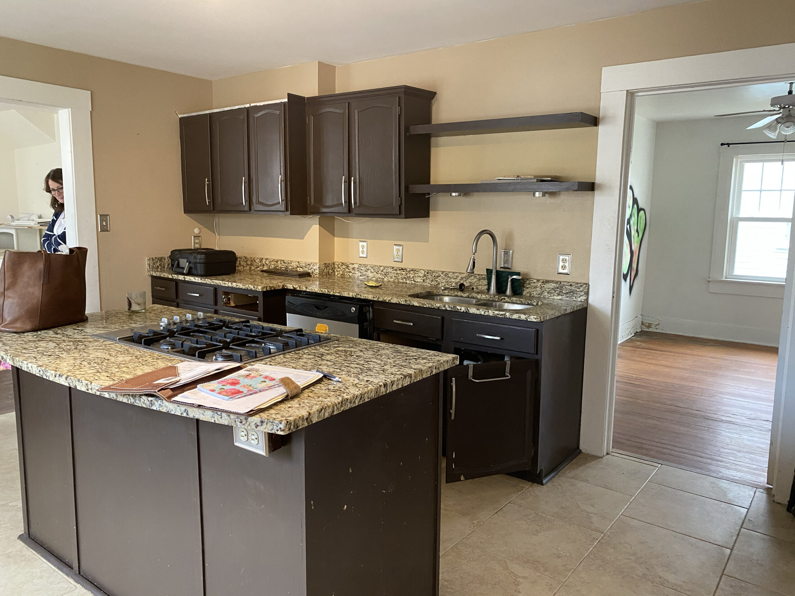
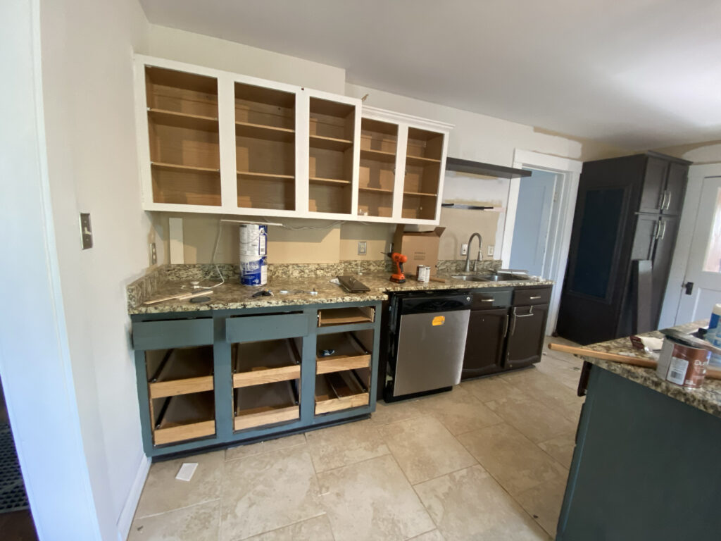
I would have loved to gut this kitchen, it just wasn’t in the budget! This was all cosmetic, but the changes went a long ways! The only “demo” I did in this space was to swap the location of the fridge with the adjoining cabinets. Brand new door faces painted in a lovely two tone combo of SW Pure White and gray-green SW homburg gray, help to dull the yellow tones in the granite. The walls being painted a subtle neutral (aesthetic white) also help tone down the countertops. I replaced the veneers on the shelves and stained them in a natural color to add some visual interest. New bright white ceramic subway tile, hardware and lighting, with a large open shelving unit were the final touches to bring this kitchen back to life.
![]()
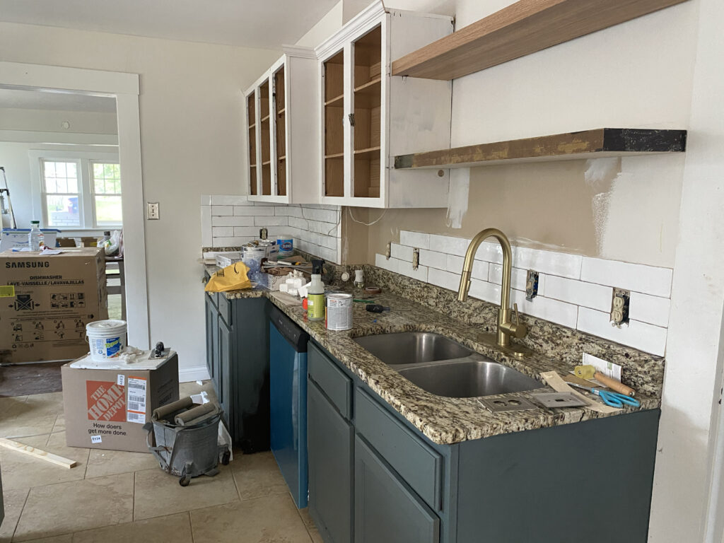
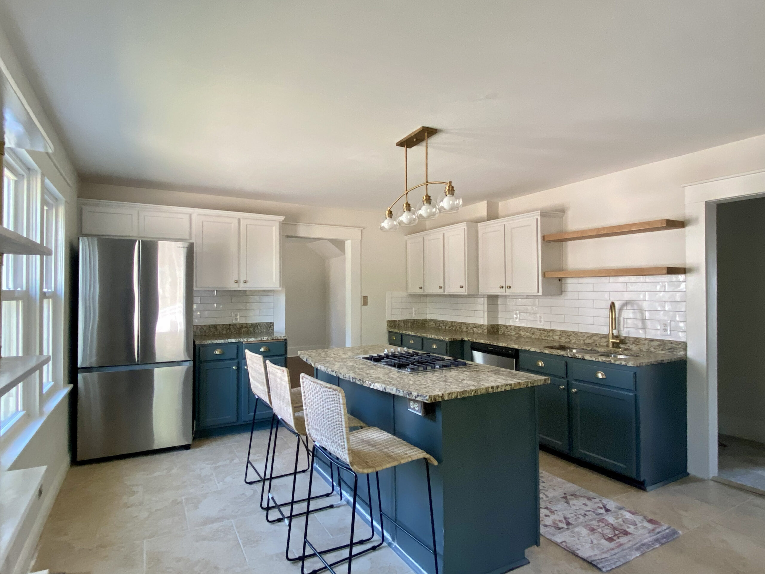
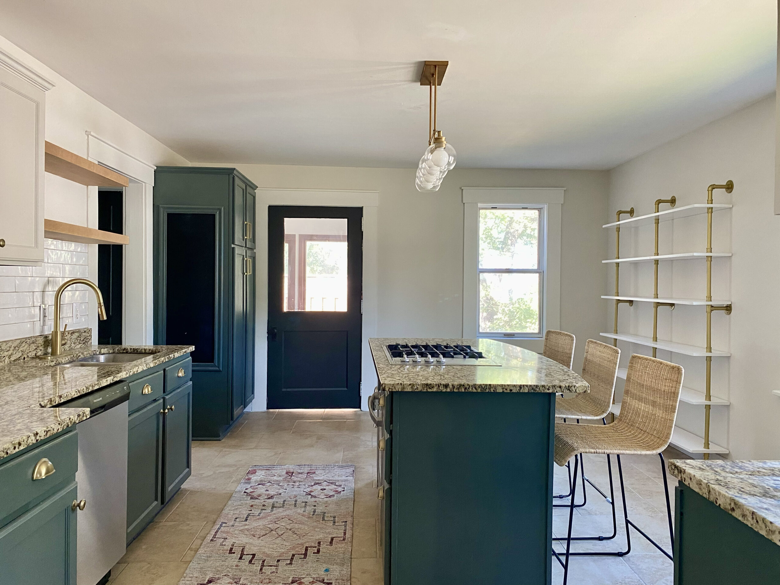
The Fireplace: A Simple cosmetic upgrade
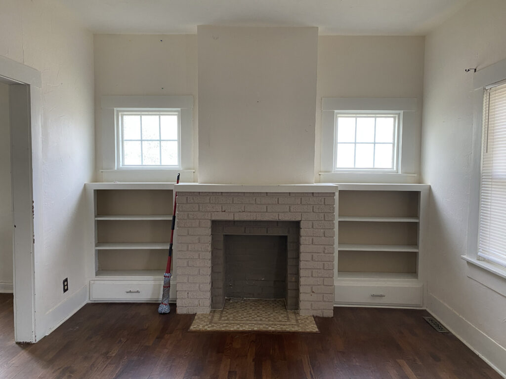
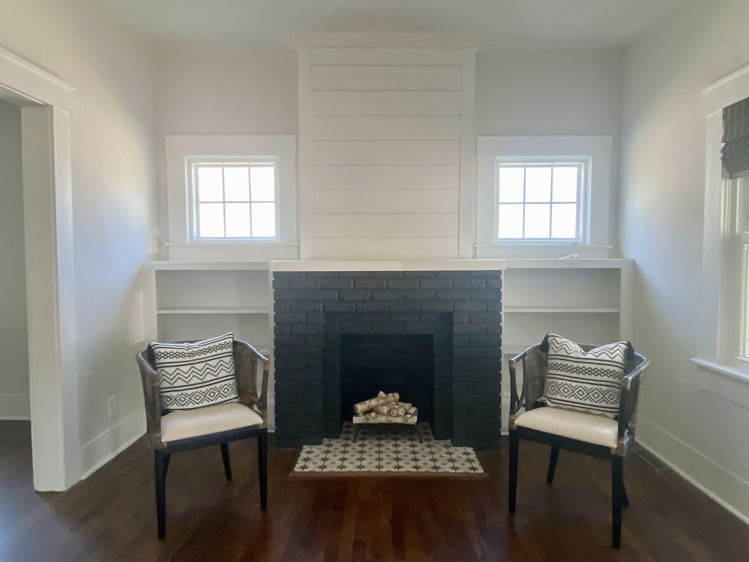
Like many fireplaces in this age of home, it simply didn’t function. The price to make it function was astronomical, and there was no way I was removing the character. So I opted to prettify it. I did a “tile-over” job on the existing tile, painted the brick in a lovely gray black (SW Iron Ore) and added shiplap above the mantle. The surrounding built-ins got a fresh coat of pure white paint. Small touches like the extra trim over the windows and the candle log insert add visual interest and make the space feel more complete.
![]()
Adding a Bathroom and Closet
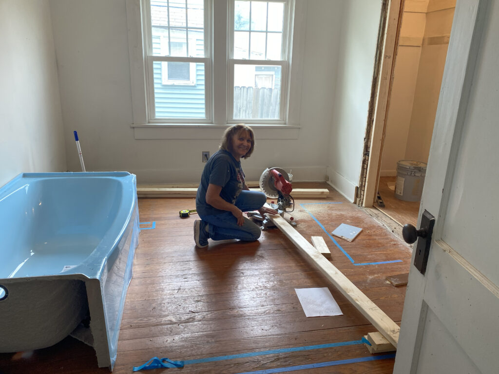
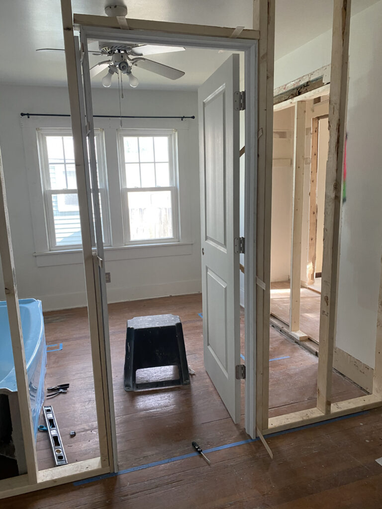
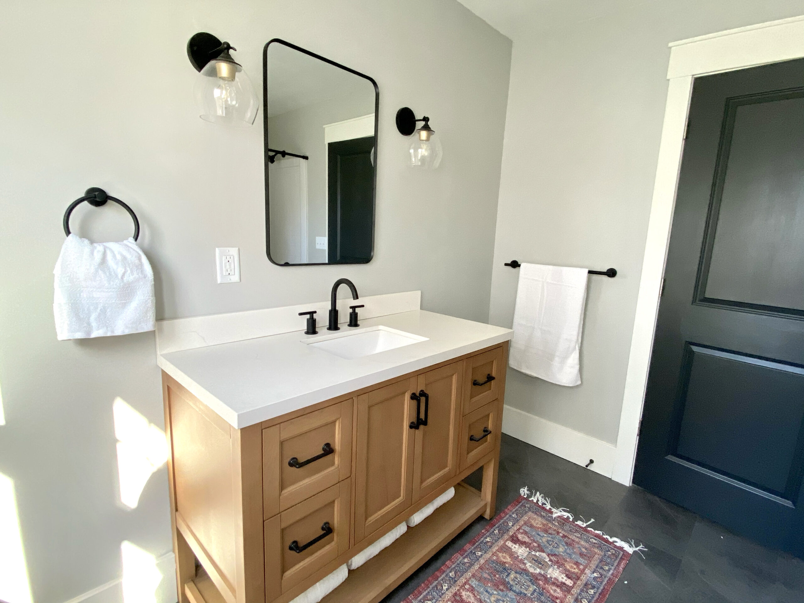
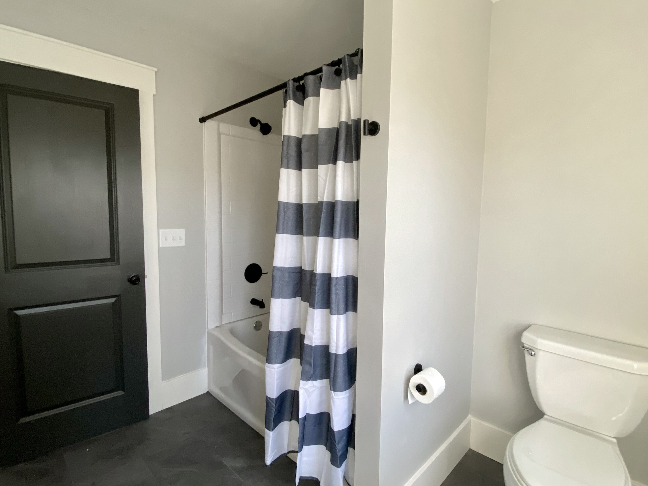
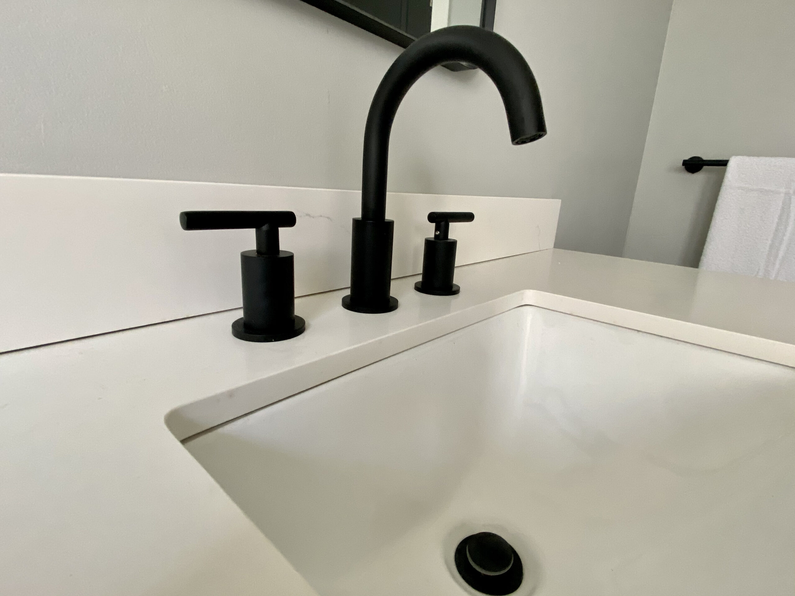
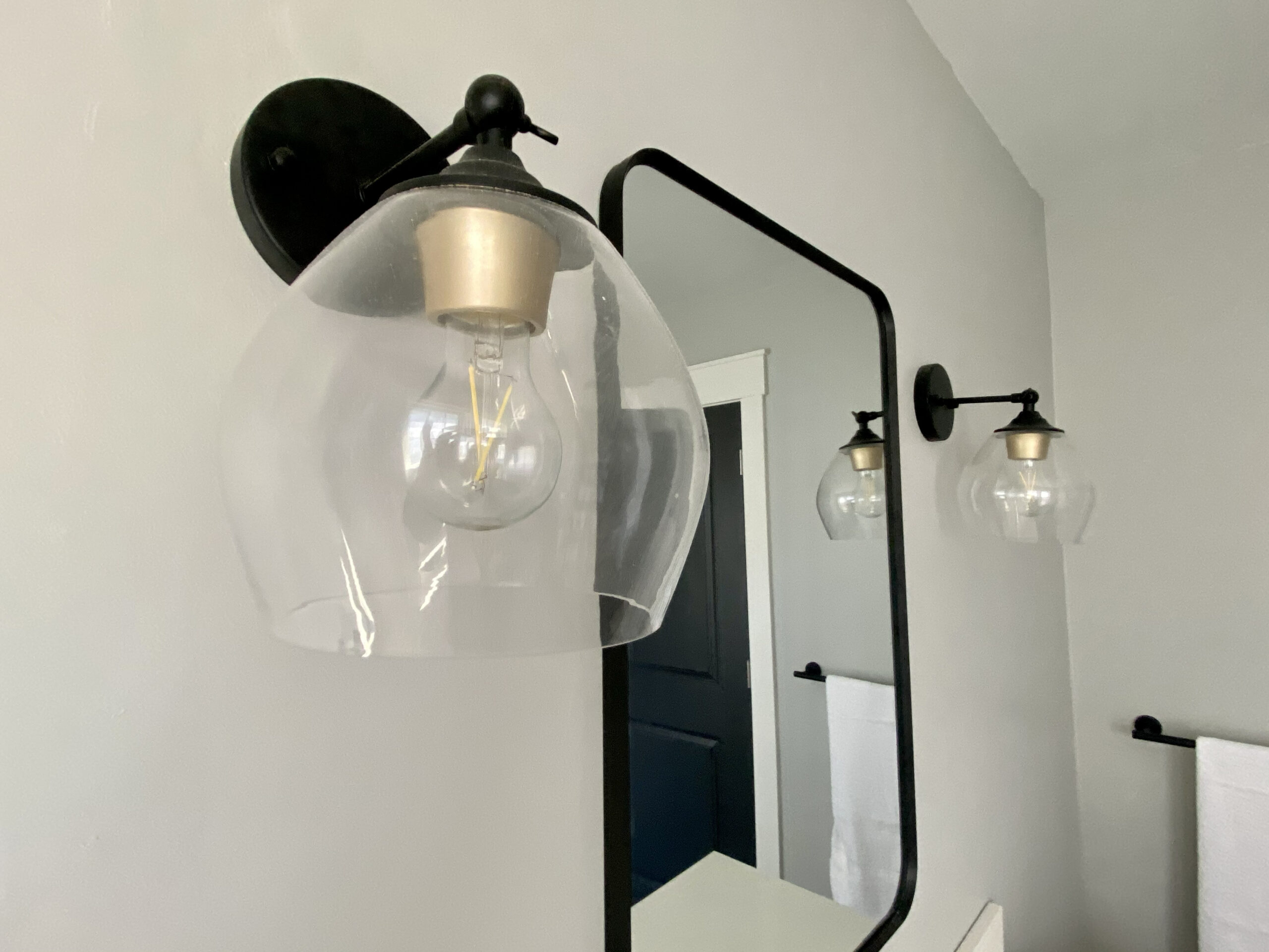
The biggest changes to this home were in the layout of the main floor bedrooms. The back bedroom was small and only accessible through the kitchen. In order to use the main floor bathroom, you had to go through one of the two bedrooms. I wrestled with the idea of converting the back bedroom into a bathroom because I didn’t want to lose it. But ultimately, it made more sense. The original bathroom became a large walk-in closet, and the original back bedroom became a nice sized bathroom, accessible to the main house and master bedroom.
![]()
![]()
![]()
![]()
![]()
![]()
The Exterior & Foundation
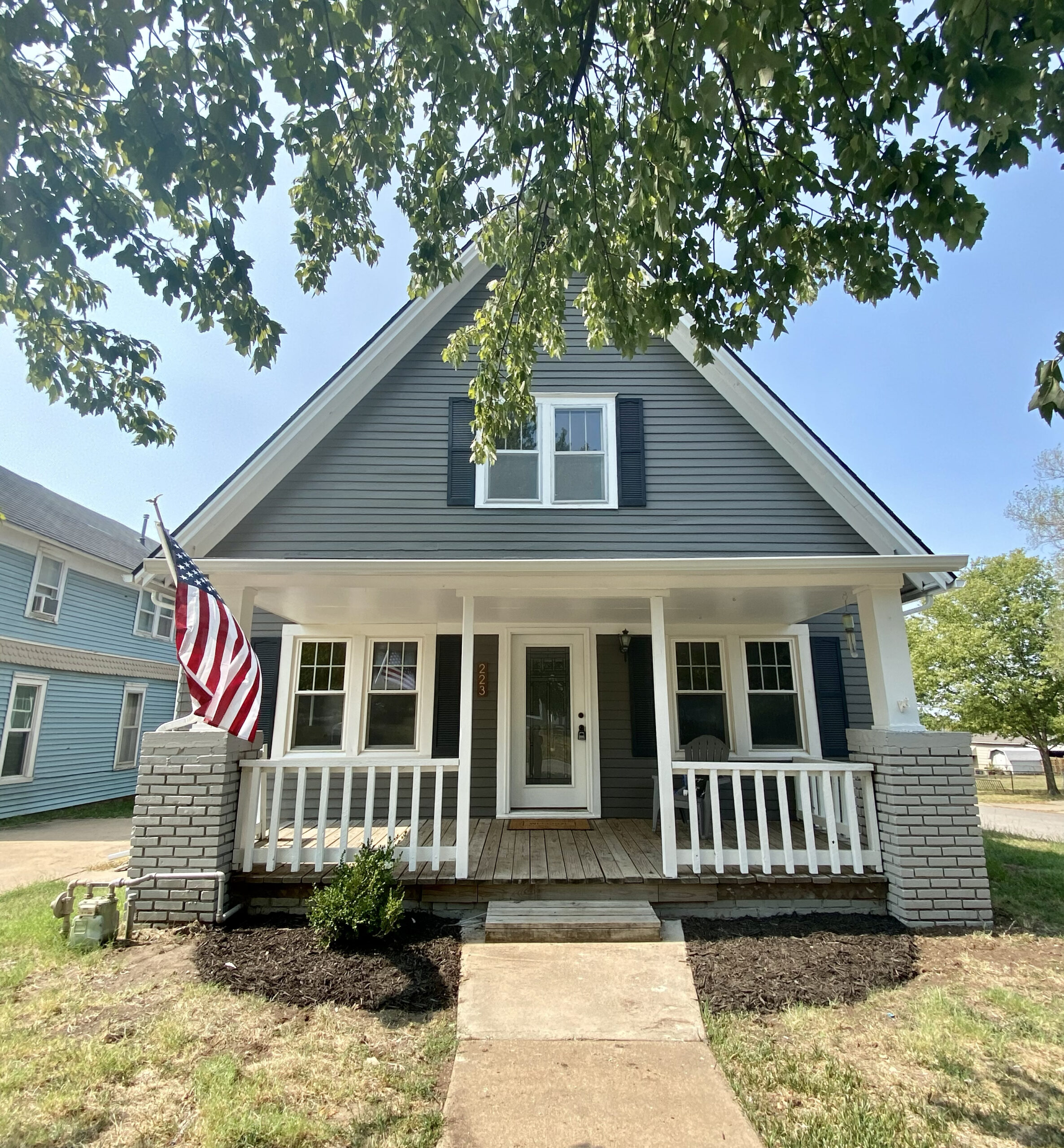
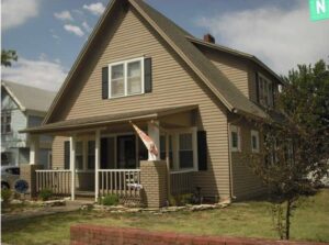
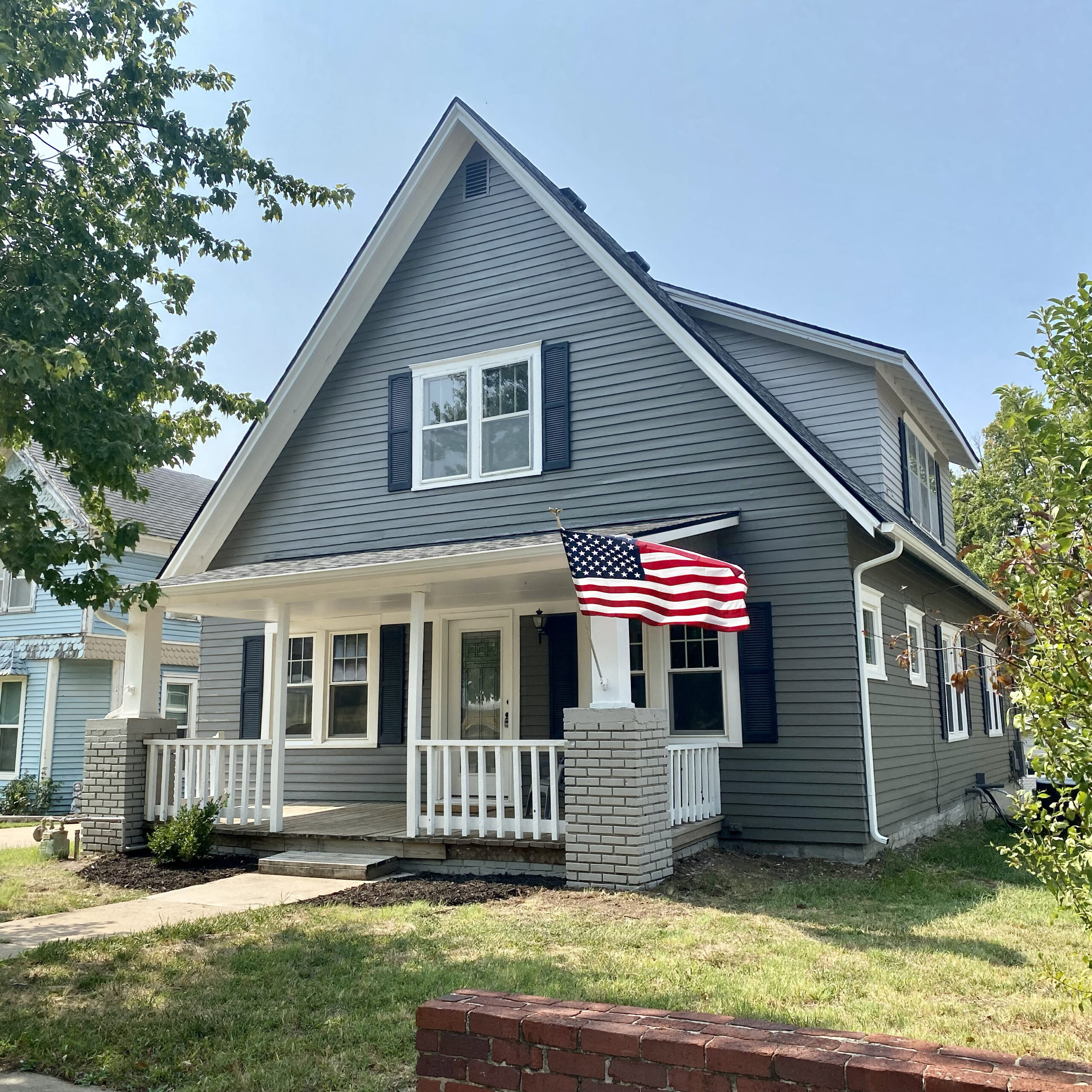
Did I mention what a huge undertaking the exterior and foundation was? Fortunately, I found a foundation company willing to take it on, and a painting company to redo the exterior within budget. The painters scraped and repaired ALL of that wood siding. They primed. And then they primed some more. And when it was finally painted out in Grizzle Gray, with Pure White accents, I started to get excited about what this house could be. The roof was redone in a black shingle. And the brick and porch posts got a fresh coat of paint as well. It’s hard to see in the photo, but the entire front facing right corner of the house had to be rebuilt by the foundation company. When you walked in the living room, the floors sloped so severely that you felt like you were walking on a hill. The guys added many footers and hydraulic lifts to get it back into shape. Those repairs were hard and costly to make, but necessary, for this house to stand the test of time for a hundred more years!
![]()
![]()
The Upstairs
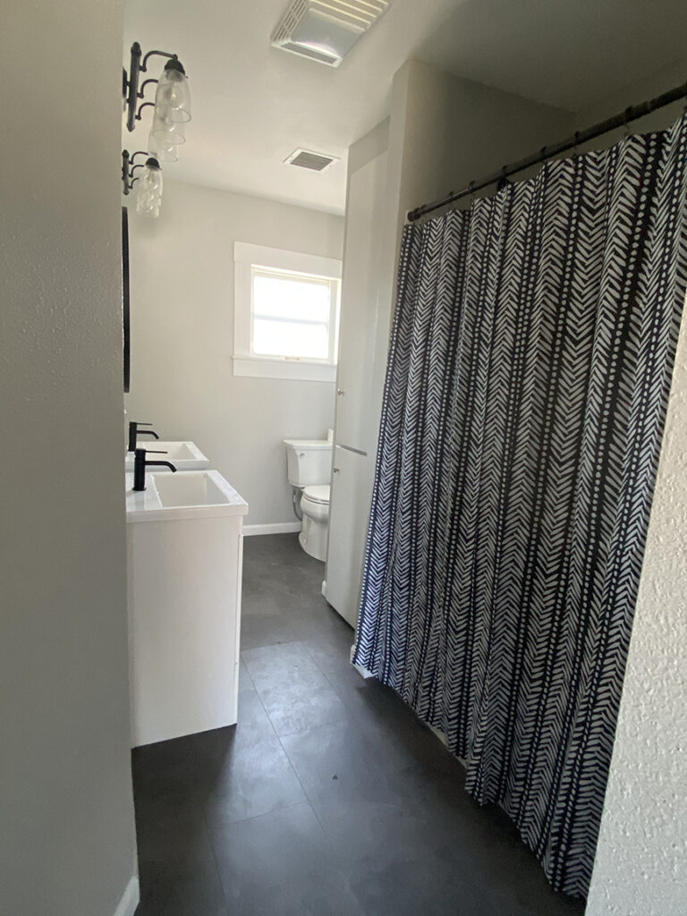
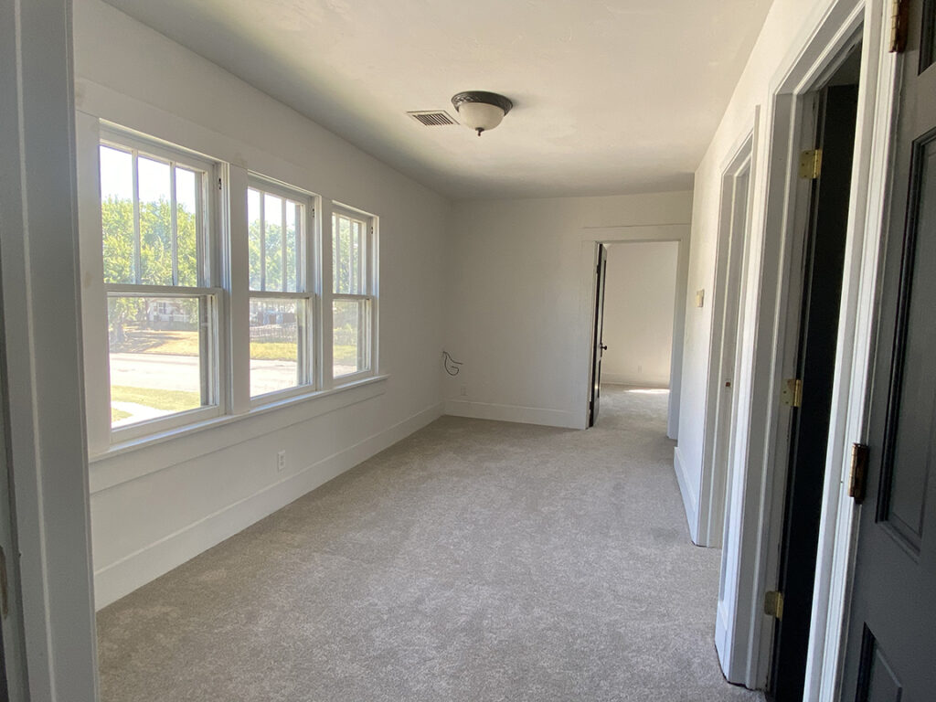
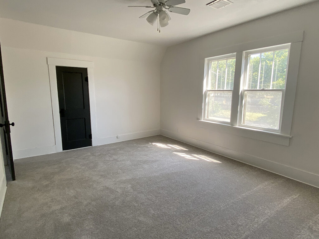
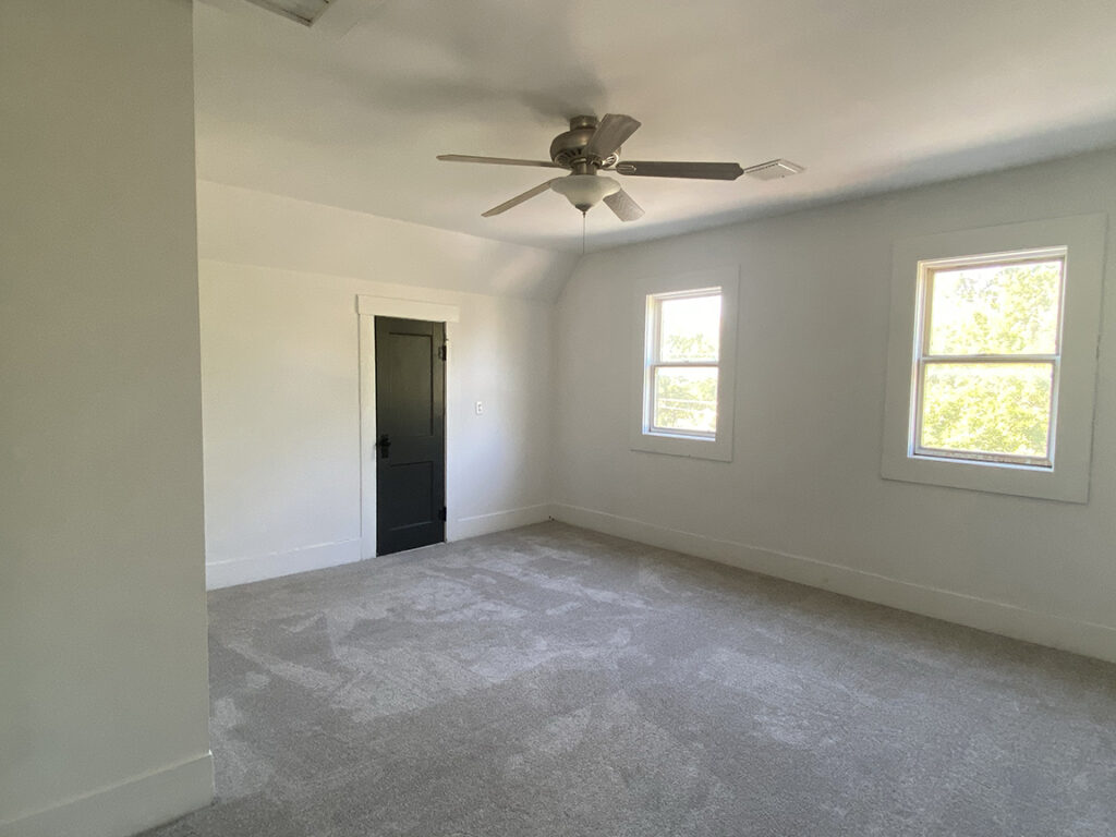
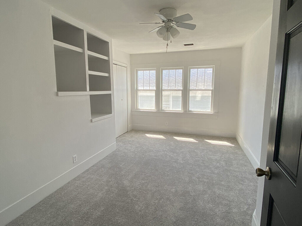
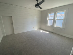
Upstairs were 3 additional bedrooms, a living room and bathroom. These all got (several) fresh coats of paint and flooring. The bathroom go two new vanities and fixtures! All of the trim was painted out in white, and the doors black to be consistent with the main floor.
