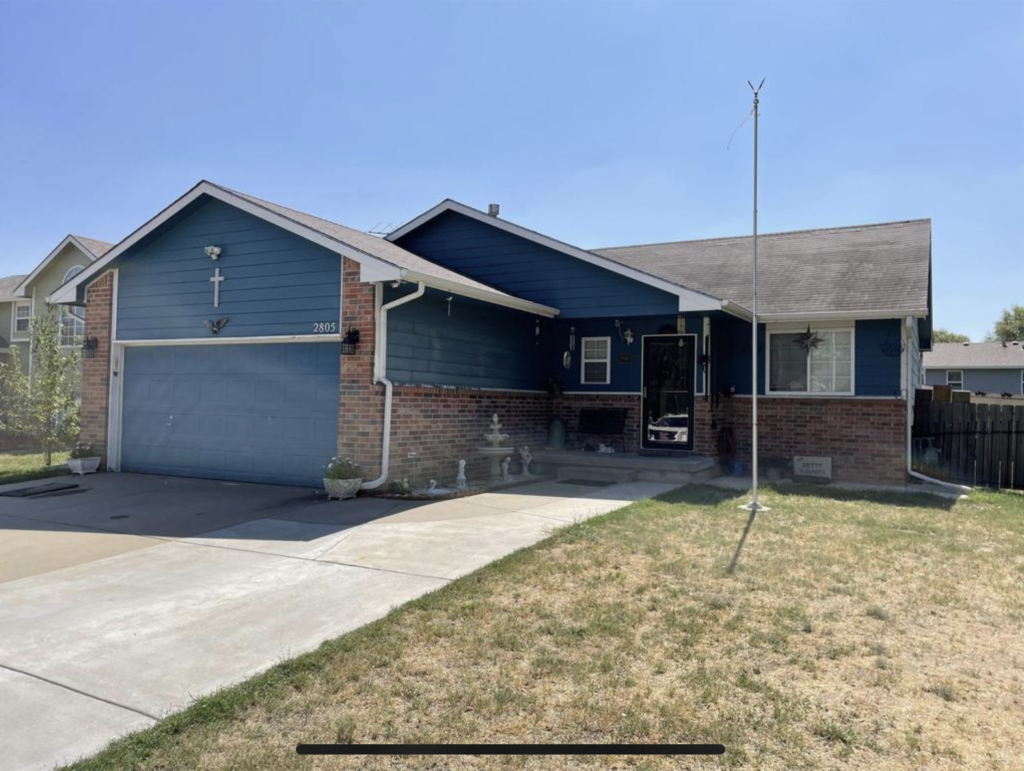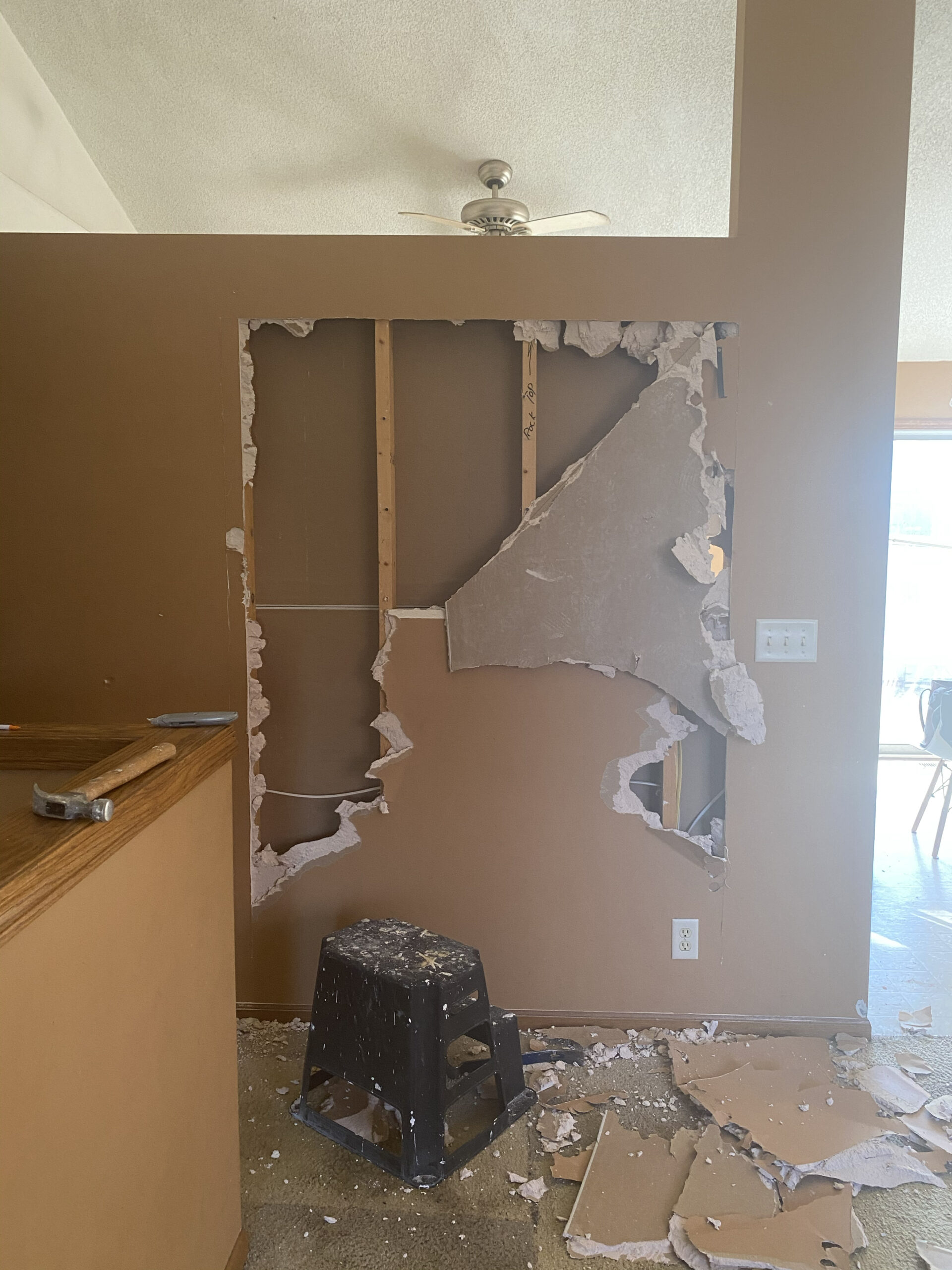
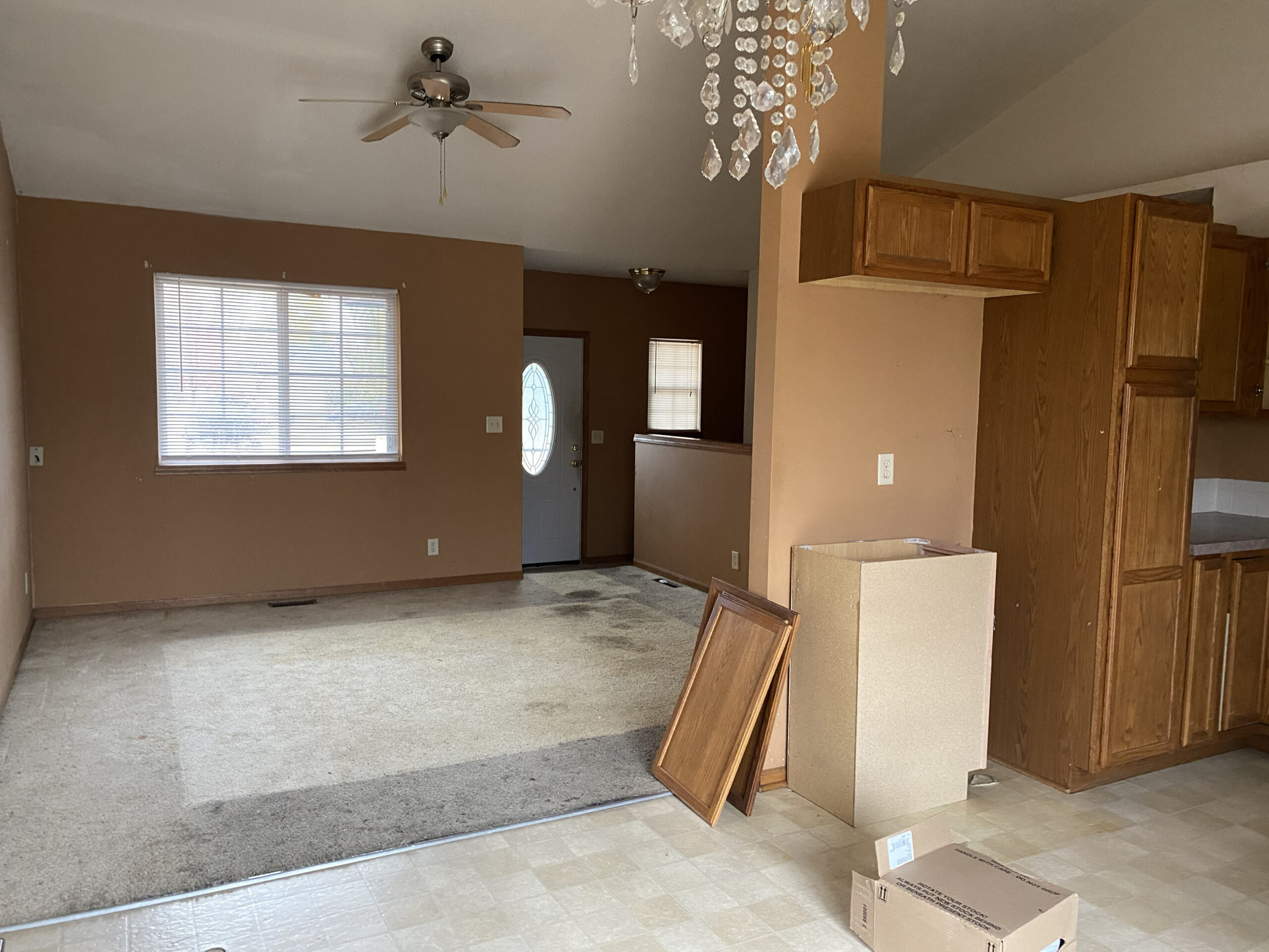
I’ve seen this layout more times than I can count while house hunting over the last several years. In the 90’s, this style floor plan dominated neighborhood after neighborhood in the midwest. It’s a perfectly fine house. It’s a functional house. But after years of neglect, this particular one needed a refresh… and multiple deep cleanings.
The DEMO
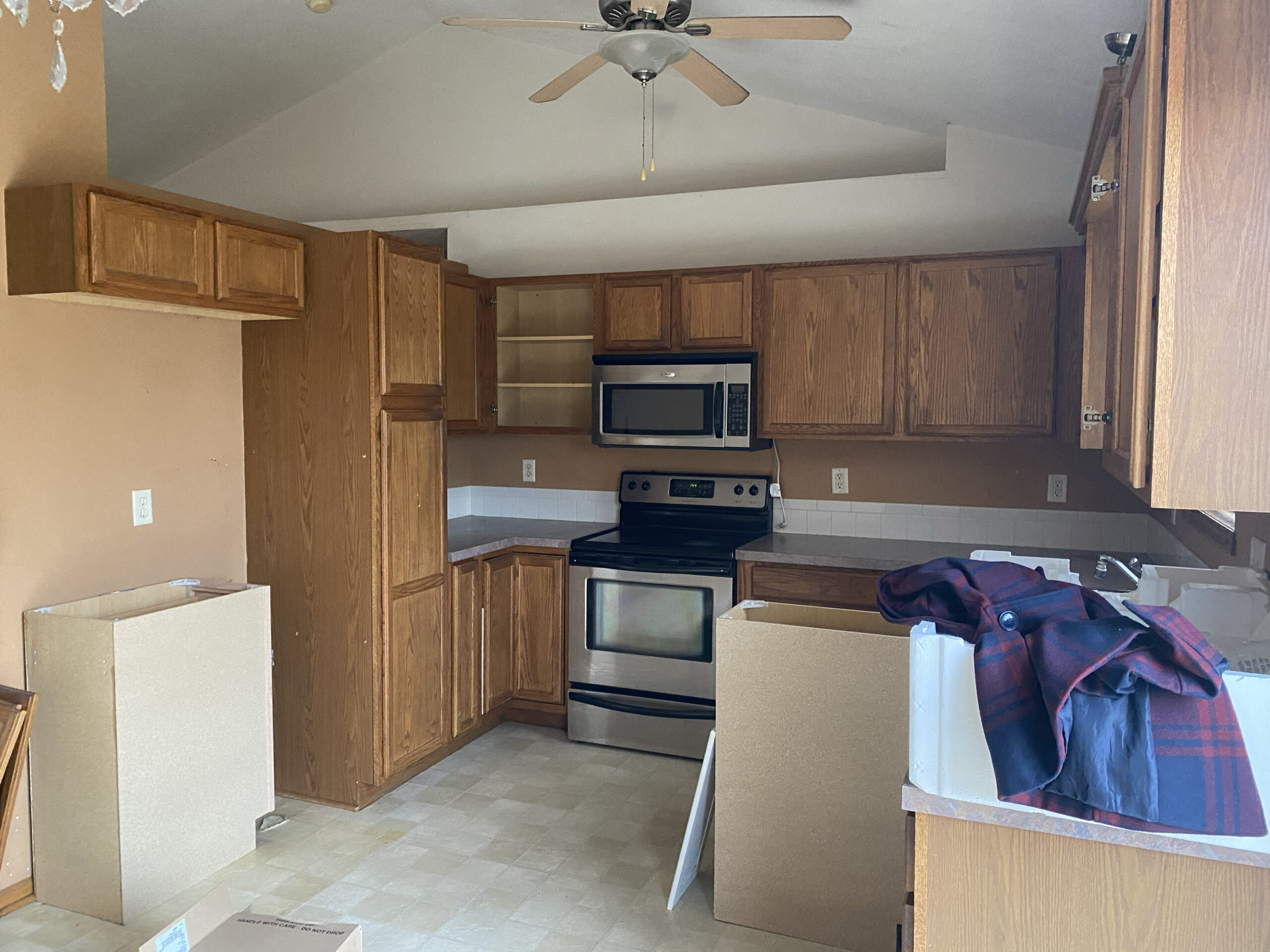
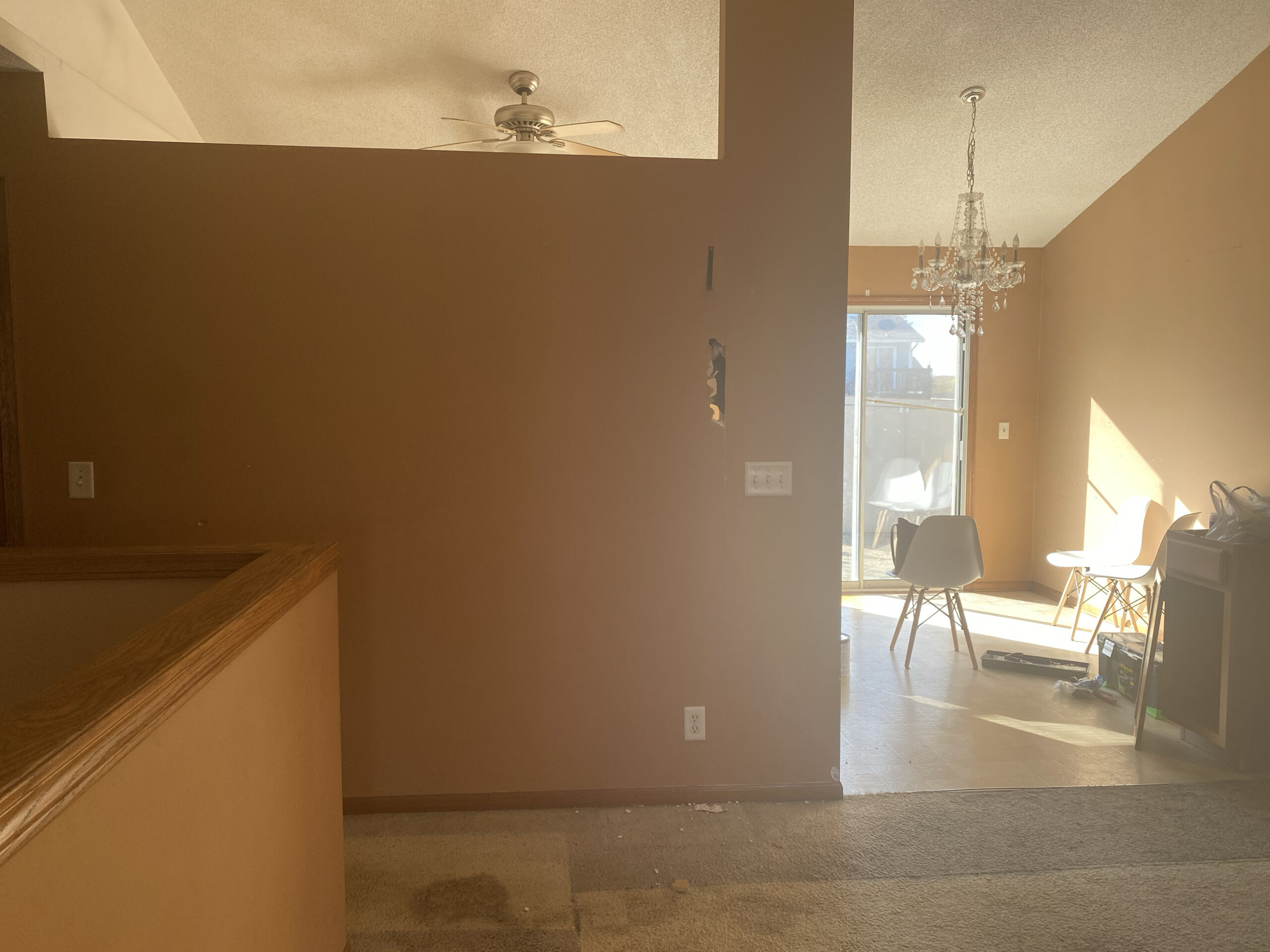
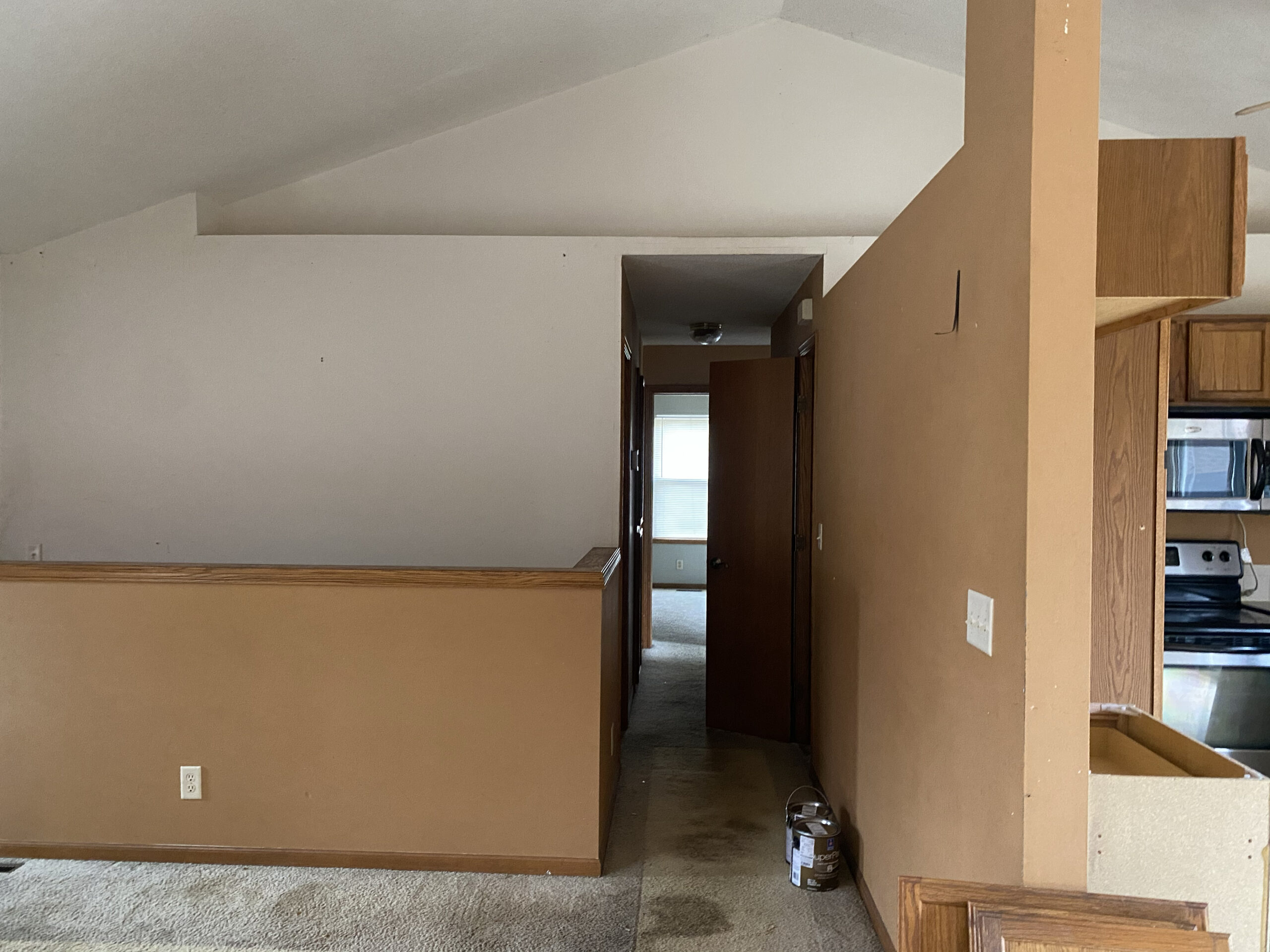
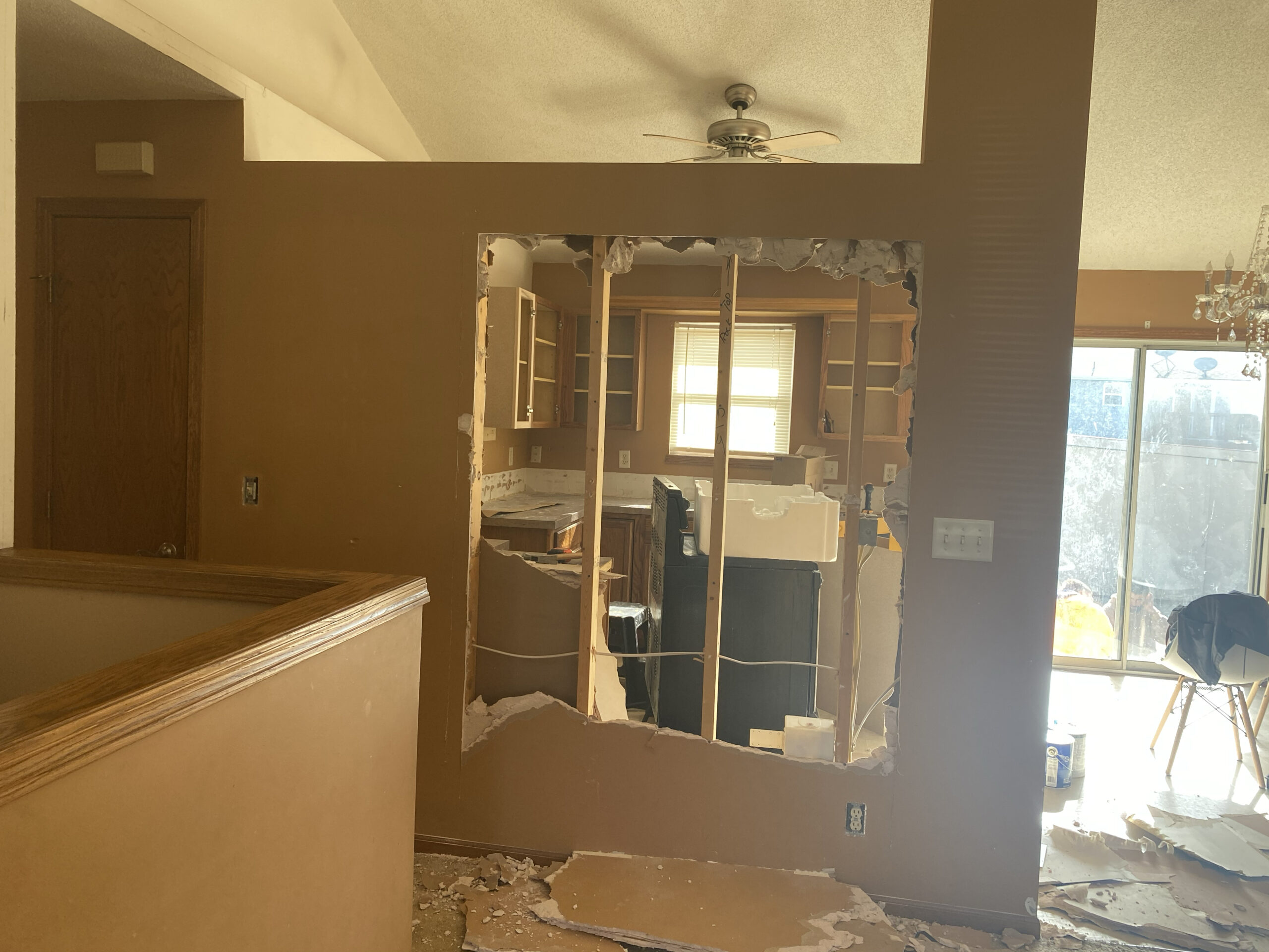
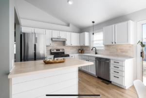
It was closed off, outdated, and the sight lines were non-existent! The spaces all felt very small with wall between the kitchen and living room. Because of budget restraints, I wasn’t able to remove it entirely – there was electrical running through it – so I opted to open a doorway and add a peninsula. It kind of keeps the spaces separate as well, which doesn’t hurt my feelings.
The Kitchen Finishes
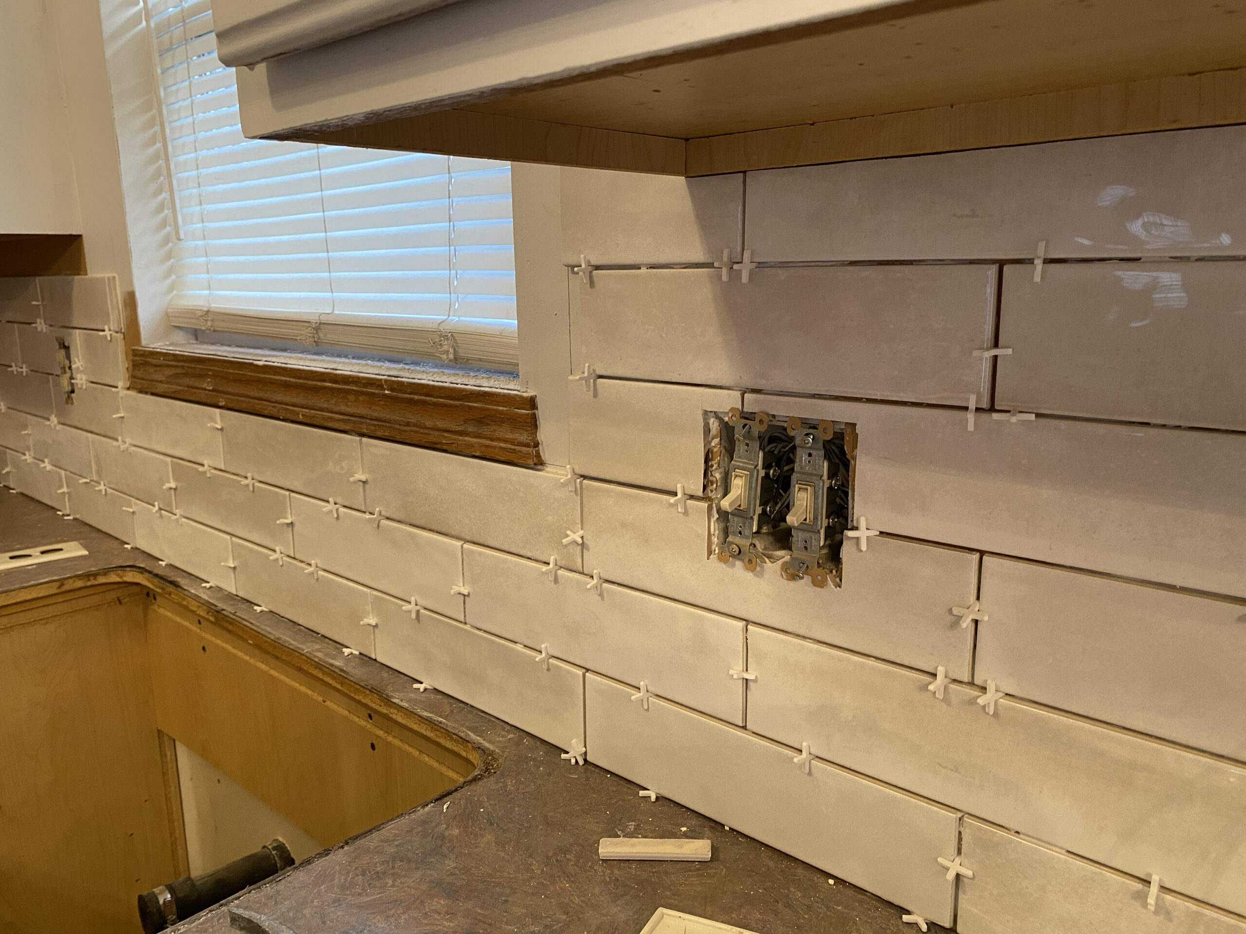
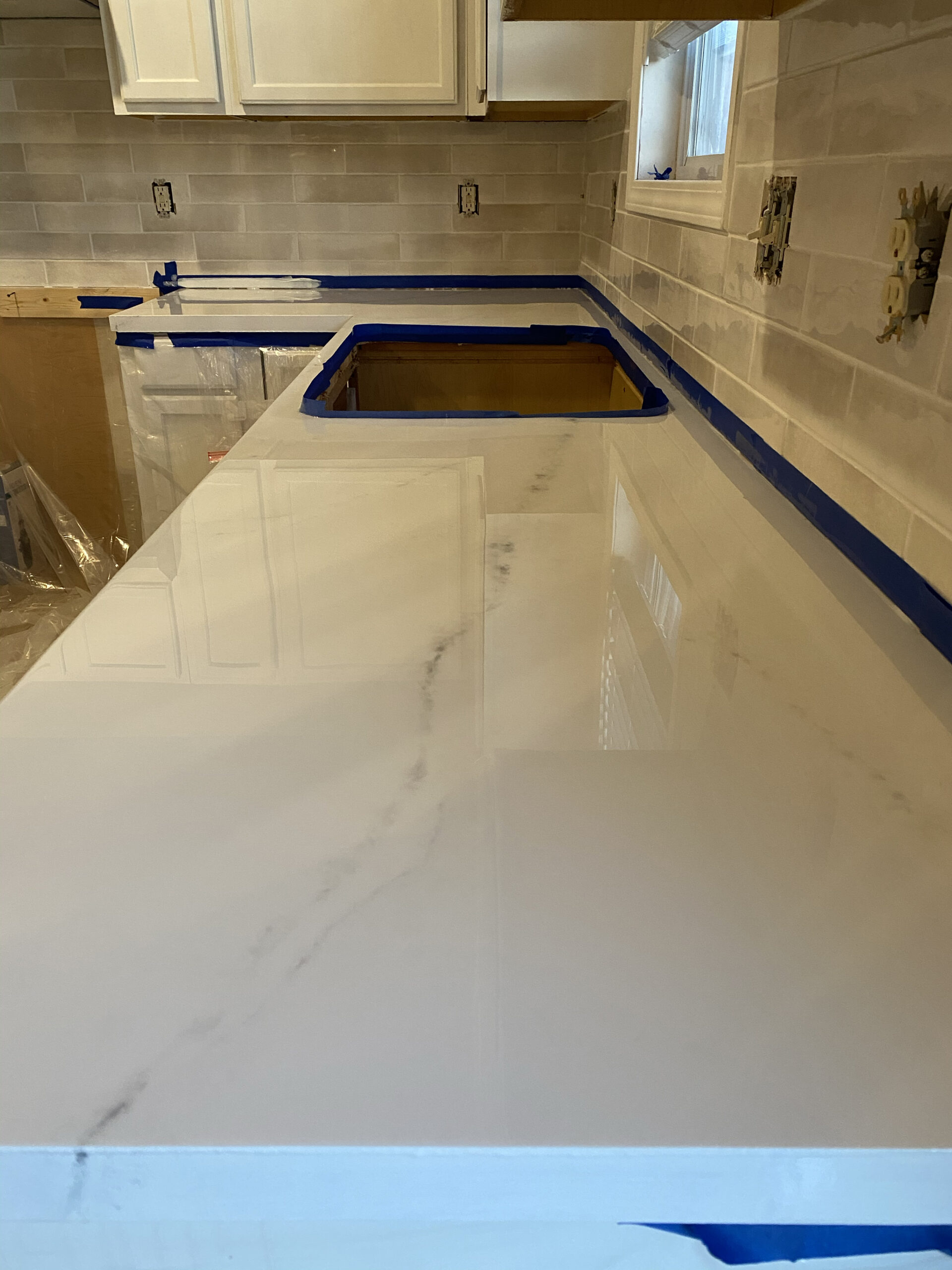
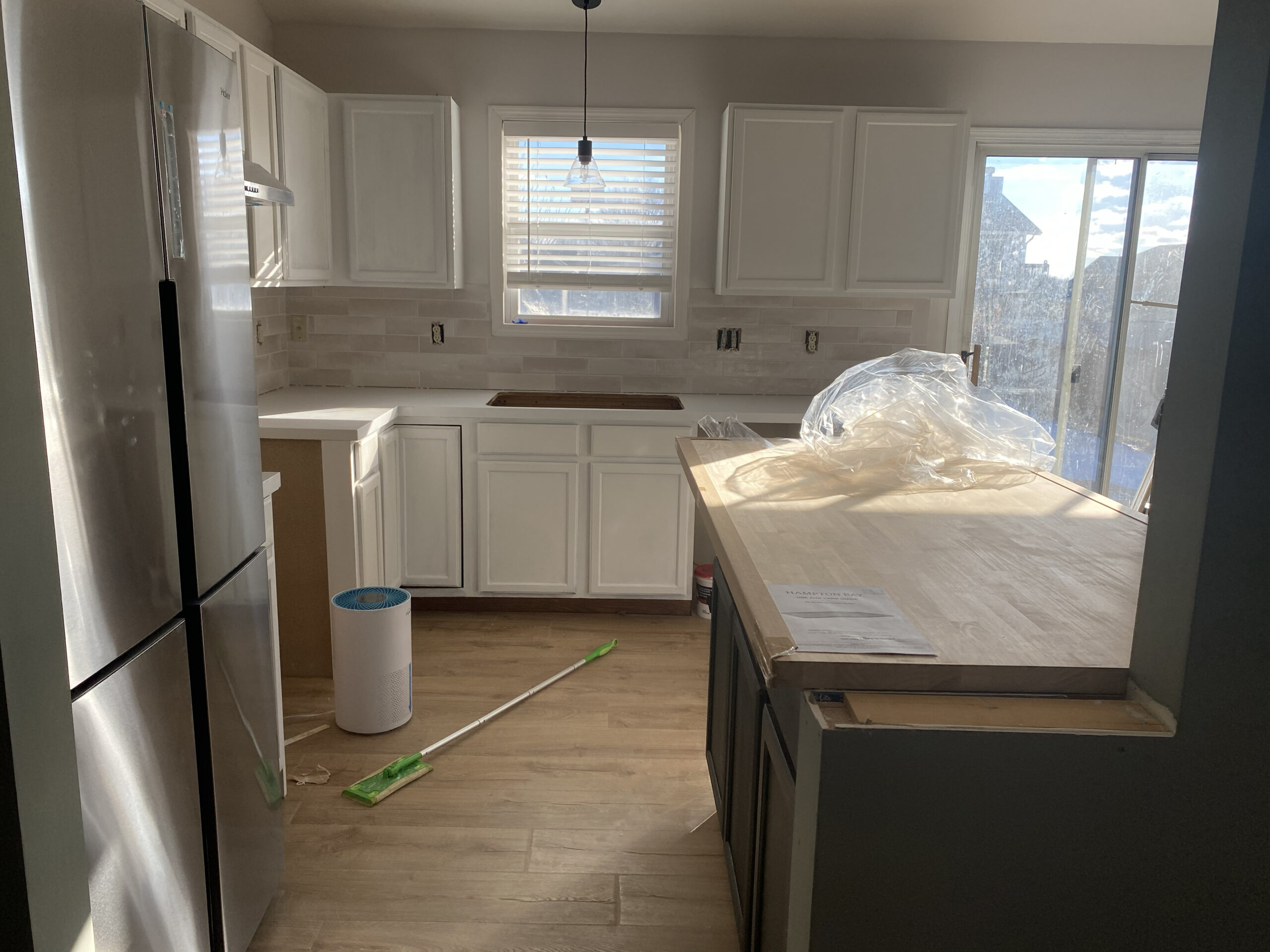
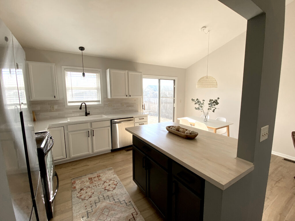
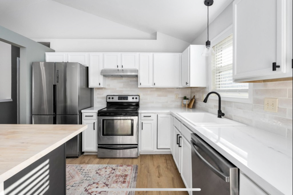
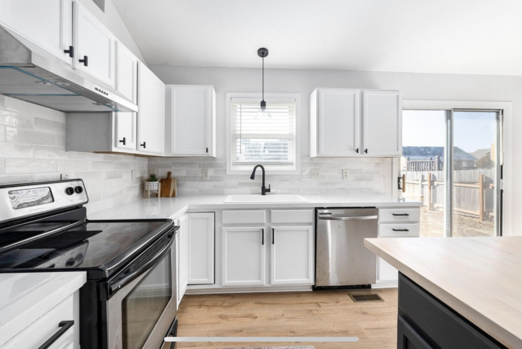
Once that wall was opened up, the space felt twice as large. Because I had reworked the kitchen layout, I had to add and subtract a few cabinets. I was able to salvage most of them, and purchase matching cabinets to fill in the spaces I’d created. It was time to move on to the pretty stuff. I opted to save the countertops by doing an epoxy treatment on them. I love this product. It’s Giani and I’ve used it twice now. The end result is always stunning if you follow the directions. The backsplash is multi-colored subway tile. I needed something to add visual interest as the cabinets and countertops were both stark white. This fit the bill.
I need to warm up the space a bit (and save some money) and using a butcher block countertop for the peninsula did just that! I used a white stain and wipe on poly to finish the top.
The Main Event Finishes
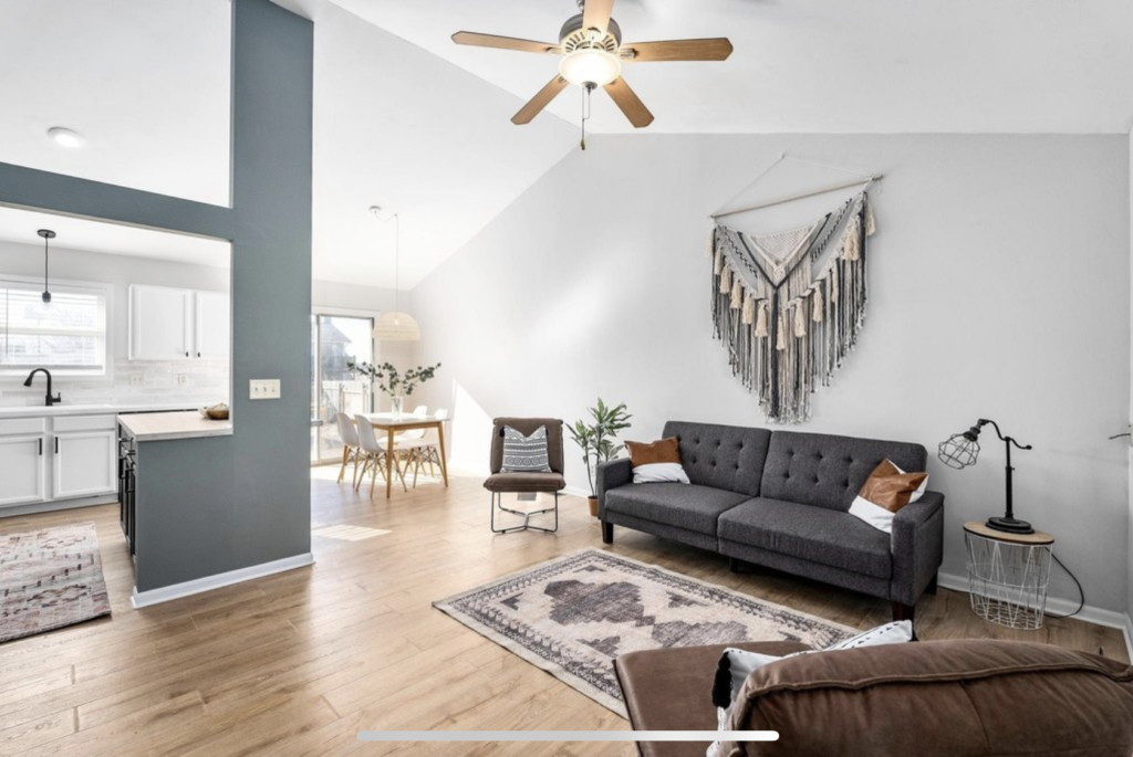
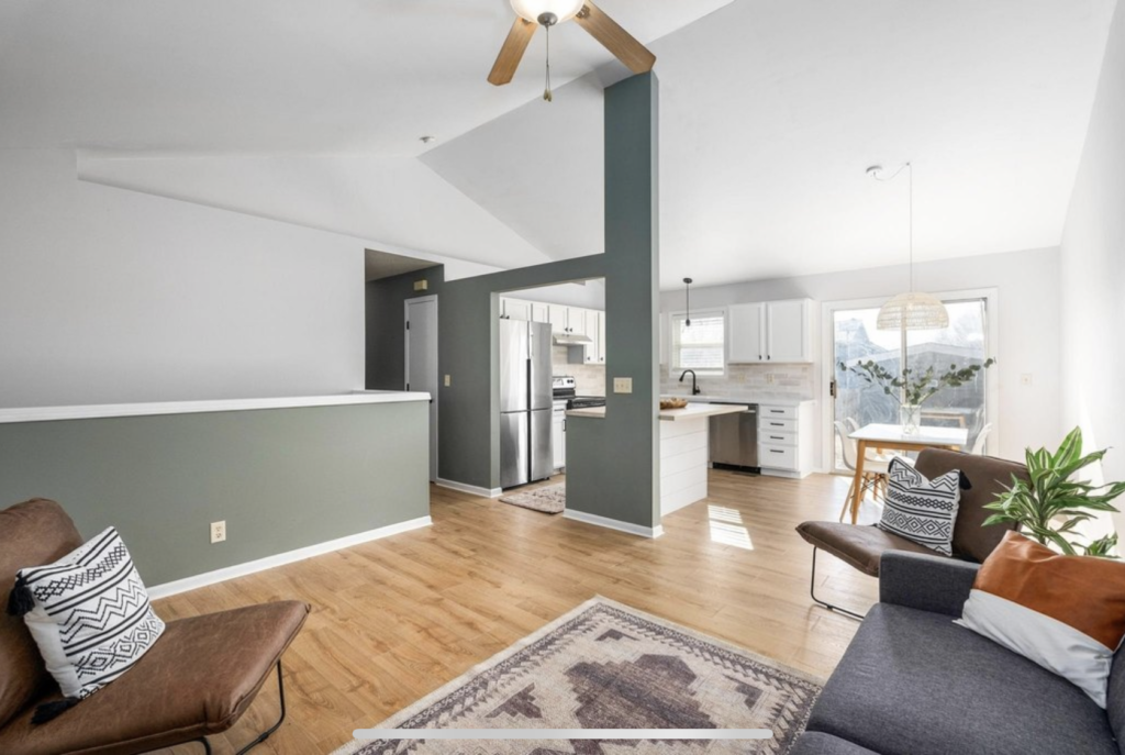
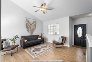
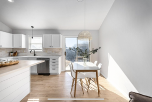
Finishes in the main living area – kitchen, living and dinging – pulled everything together once the big changes were made. I painted the walls in a warm shade of gray called SW Drift of Mist. The cabinets are SW Pure White, and the accent color is called SW Illusive Green. I opted for a mid-toned flooring by Pergo. It’s a waterproof laminate so I was able to run it through the kitchen as well.

Cosmetic all Day Long: The Bathrooms & Bedrooms Get a Refresh
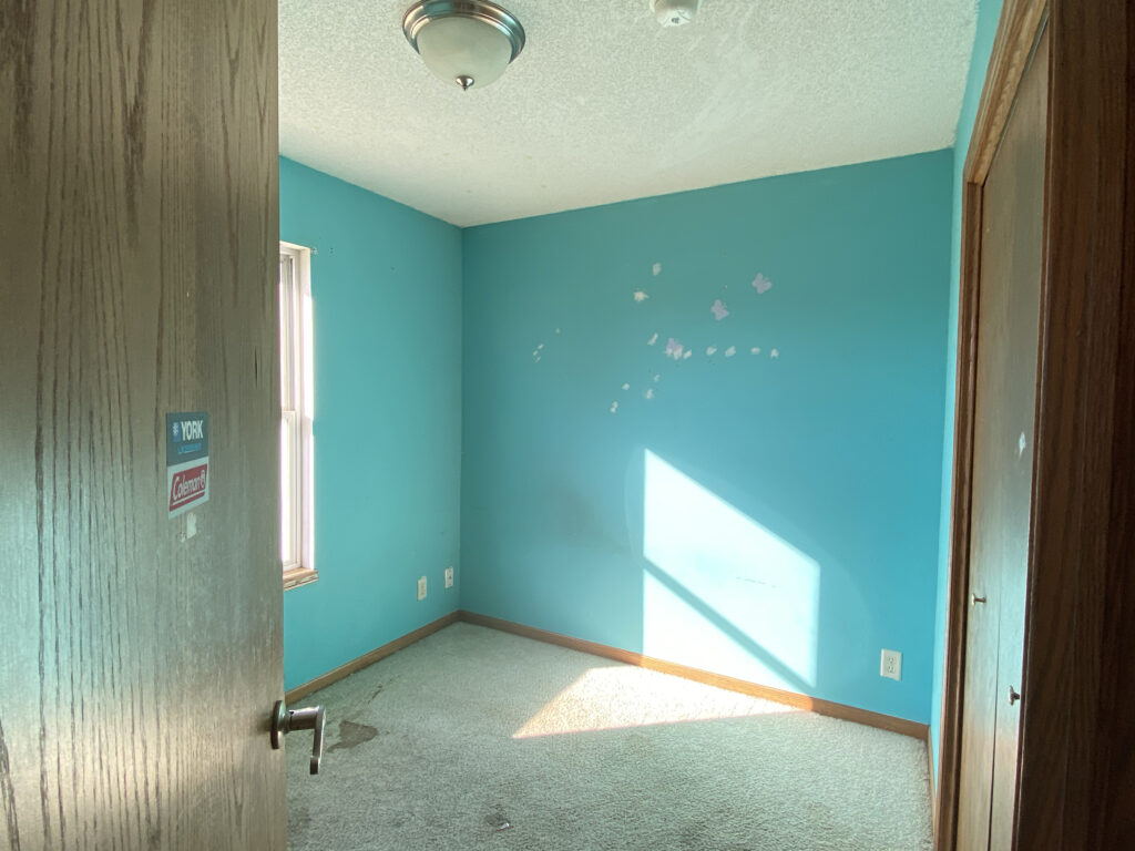
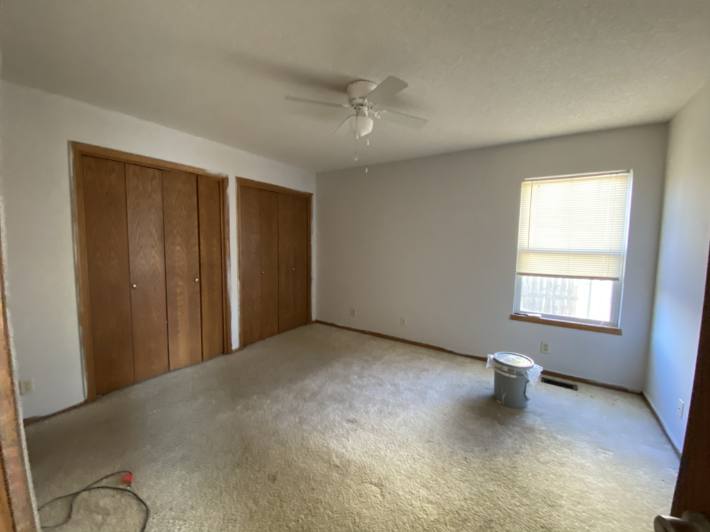
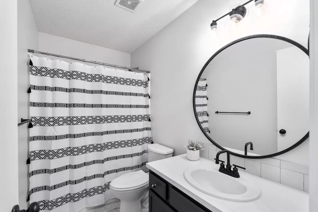
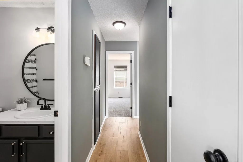
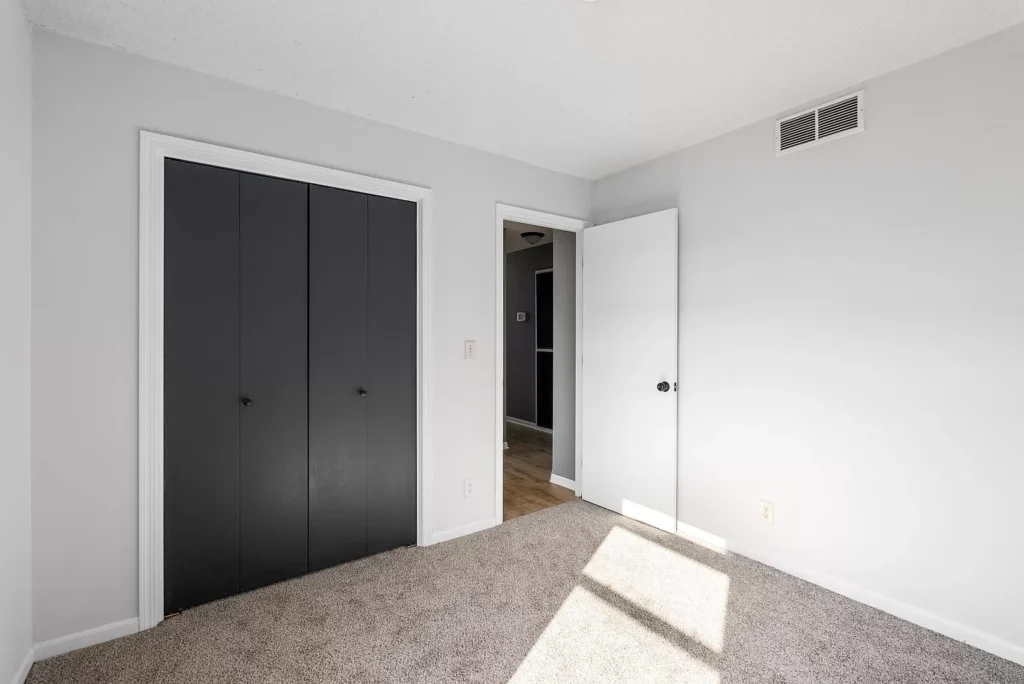
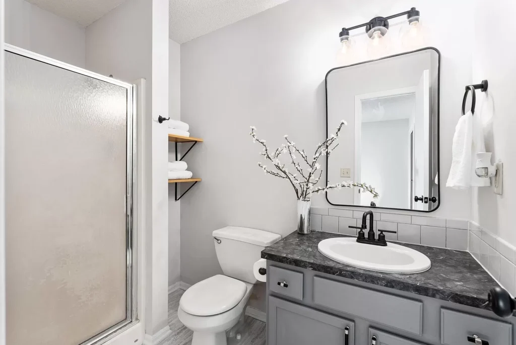
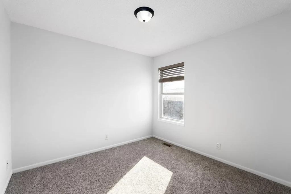
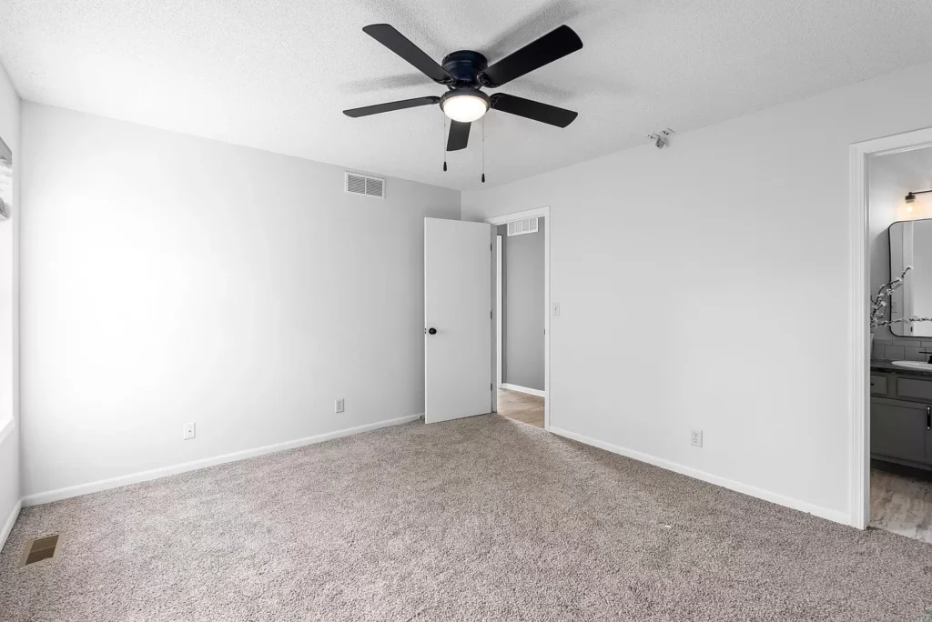
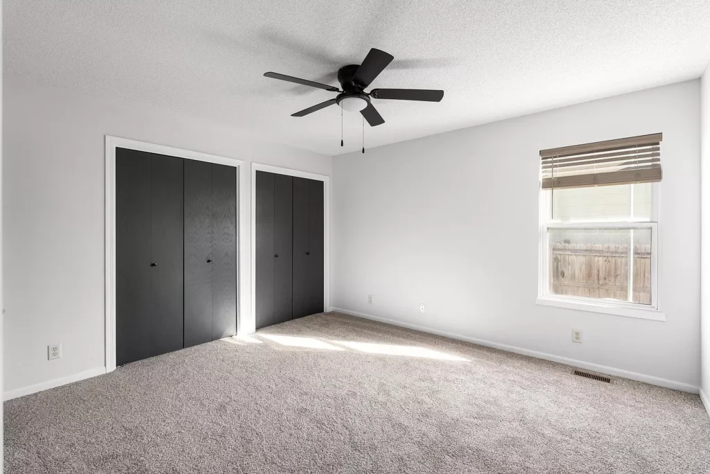
The title says it all. I didn’t go too far with these. I just made what was there better, and clean. New paint, flooring, window treatments and hardware totally changed the look of these spaces. I had extra epoxy from the kitchen, so I used that in the hall bathroom on the countertop. Paint and fixtures did the rest. The floor in the bathrooms is actually a peel and stick – yes, you heard that right. Waterproof or not, I couldn’t bring myself to put laminate in a bathroom. This peel and stick was the stickiest of sticky, and it’s not going anywhere. It brightened and modernized the bathrooms, and was the right choice for the price point of this home!

The Exterior
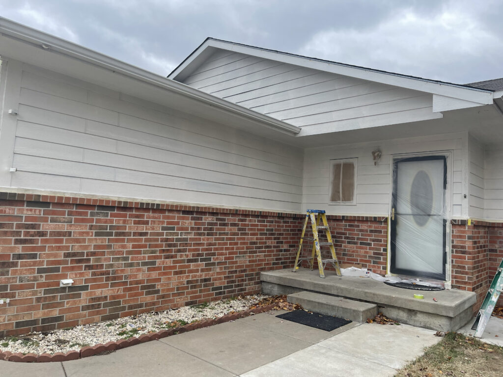
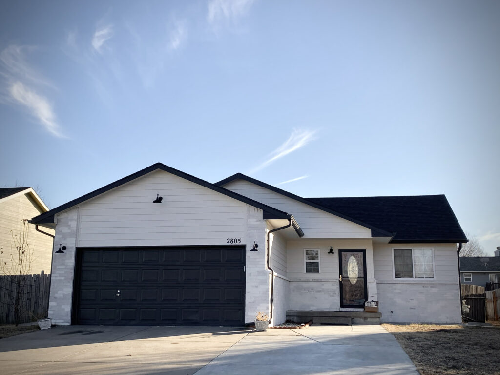
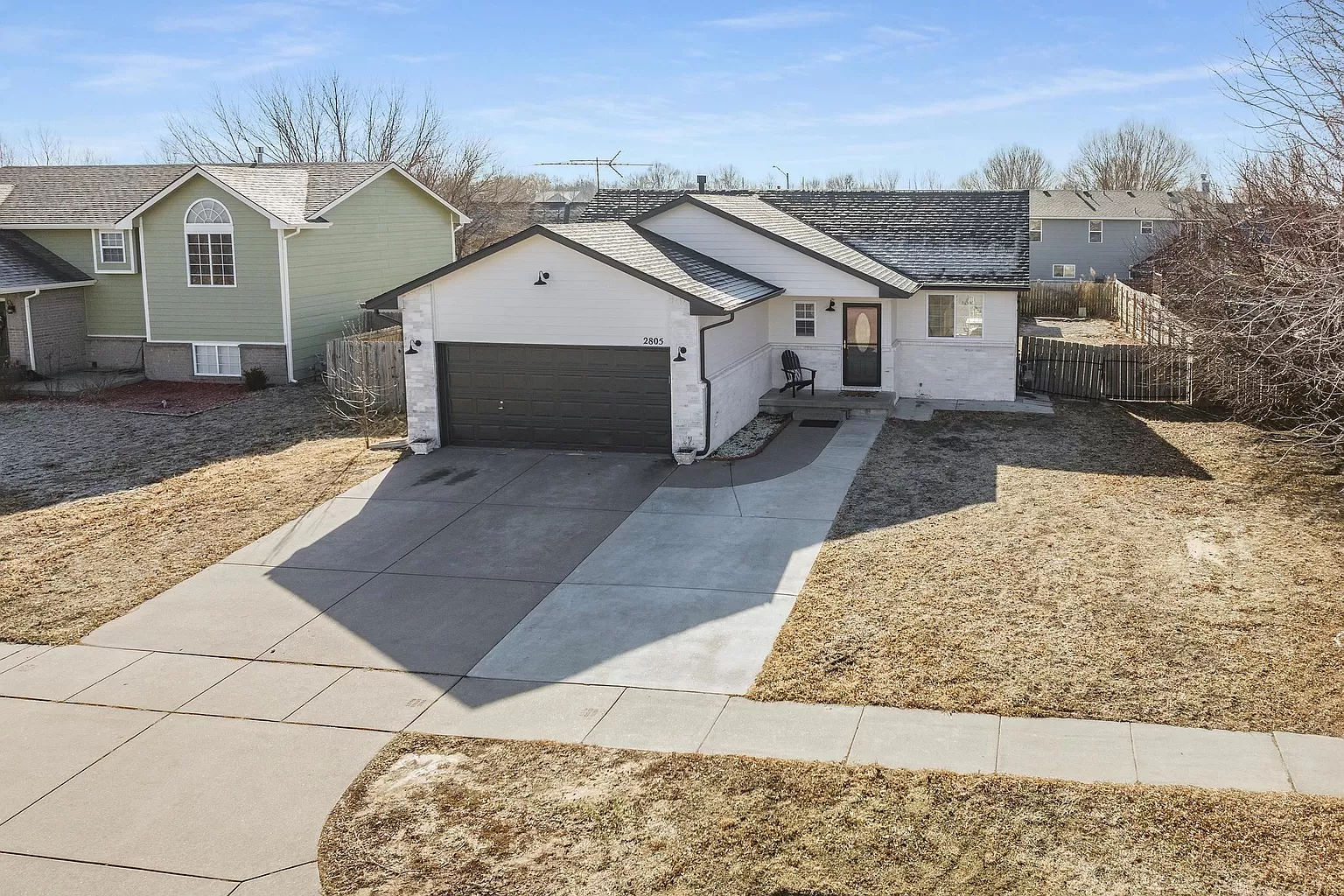
I started with a fresh white paint on the siding. The blue just wasn’t doing it. But once it was painted, the brick stood out like a sore thumb. My solution was to use a lime wash product that I’d previously used on my own home to tone it closer to the siding color. Black accents and a new black roof modernized it a bit, and made it stand out in the neighborhood.
